TailwindCSS comes with utilities to manage the state of your elements. We will cover some of them in this post. States are beneficial for users as they provide visual feedback on your element.
the Basic States

Hover state
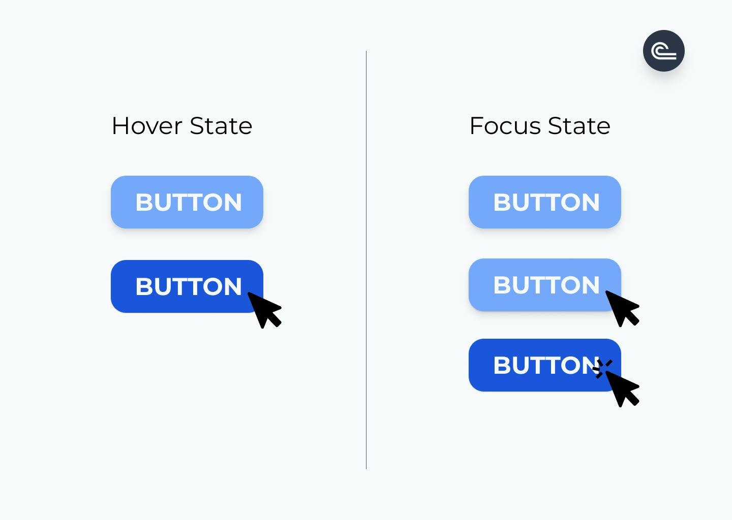
This utility allows you to change the style of your element on mouse hover.
    <!-- Background will turn blue on hover -->
    <button class="hover:bg-blue-300">BUTTON</button>
By default, you can use the Hover state prefix with the following utilities: background color background opacity border color border opacity box shadow gradient color stops opacity rotate scale skew text color text decoration text opacity
Focus state
This utility allows you to change the style of your element when it's focused (mouse click).
    <!-- Background will turn blue on focus (mouse click)-->
    <button class="focus:bg-blue-300">BUTTON</button>
By default, you can use the focus prefix with the following utilities:
accessibility, backgroundColor, backgroundOpacity, borderColor, borderOpacity, boxShadow, gradientColorStops, opacity, outline, placeholderColor, placeholderOpacity, ringColor, ringOffsetColor, ringOffsetWidth, ringOpacity, ringWidth, rotate, scale, skew, textColor, textDecoration, textOpacity, translate, zIndex
Note that you can play with the Z-index with the Focus prefix.
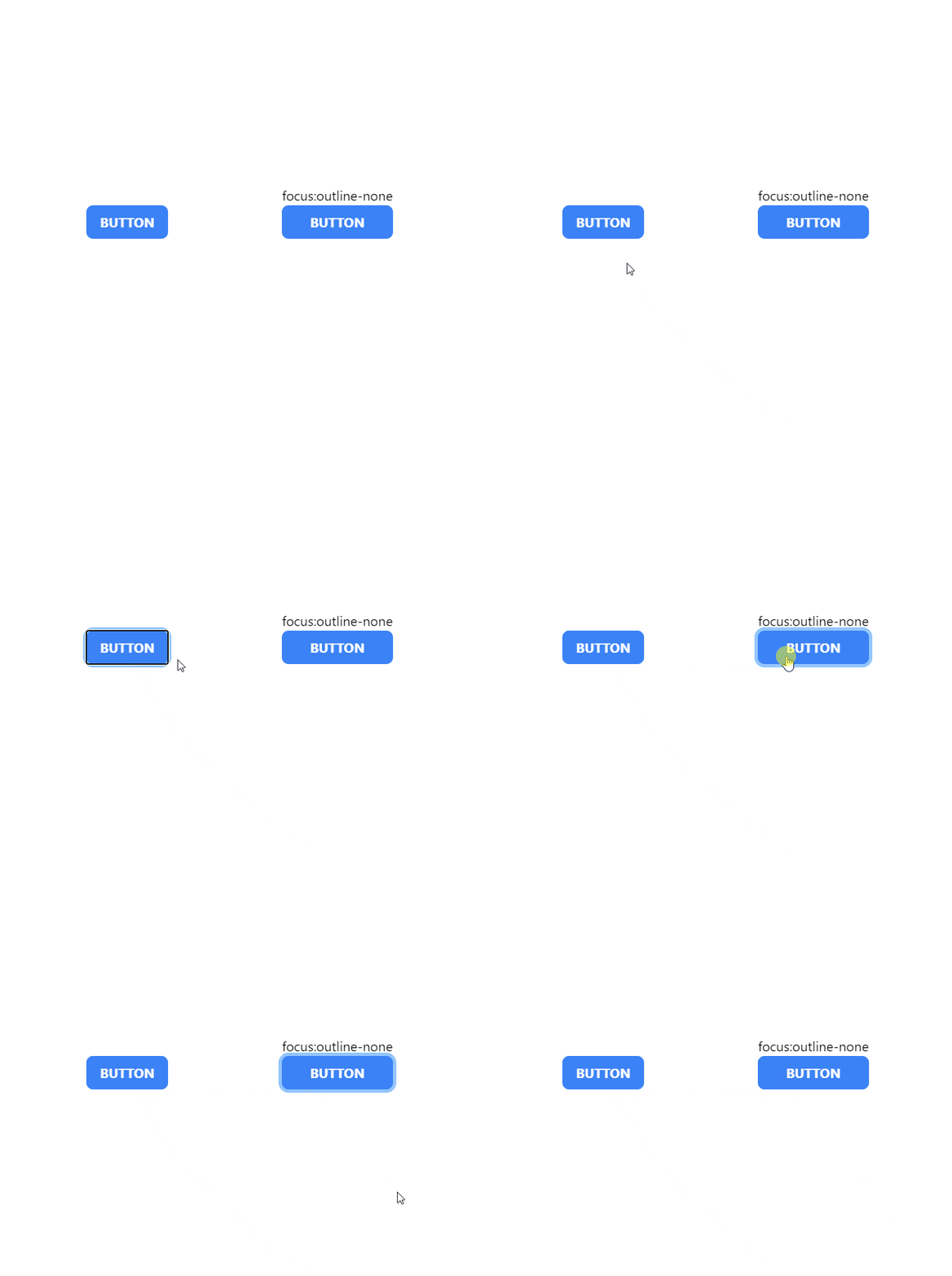
The outline utility is also especially useful. You can disable the default outline callback on focus with focus:outline-none and create your own callback style when the element is focused.

Group State

Group-Hover state
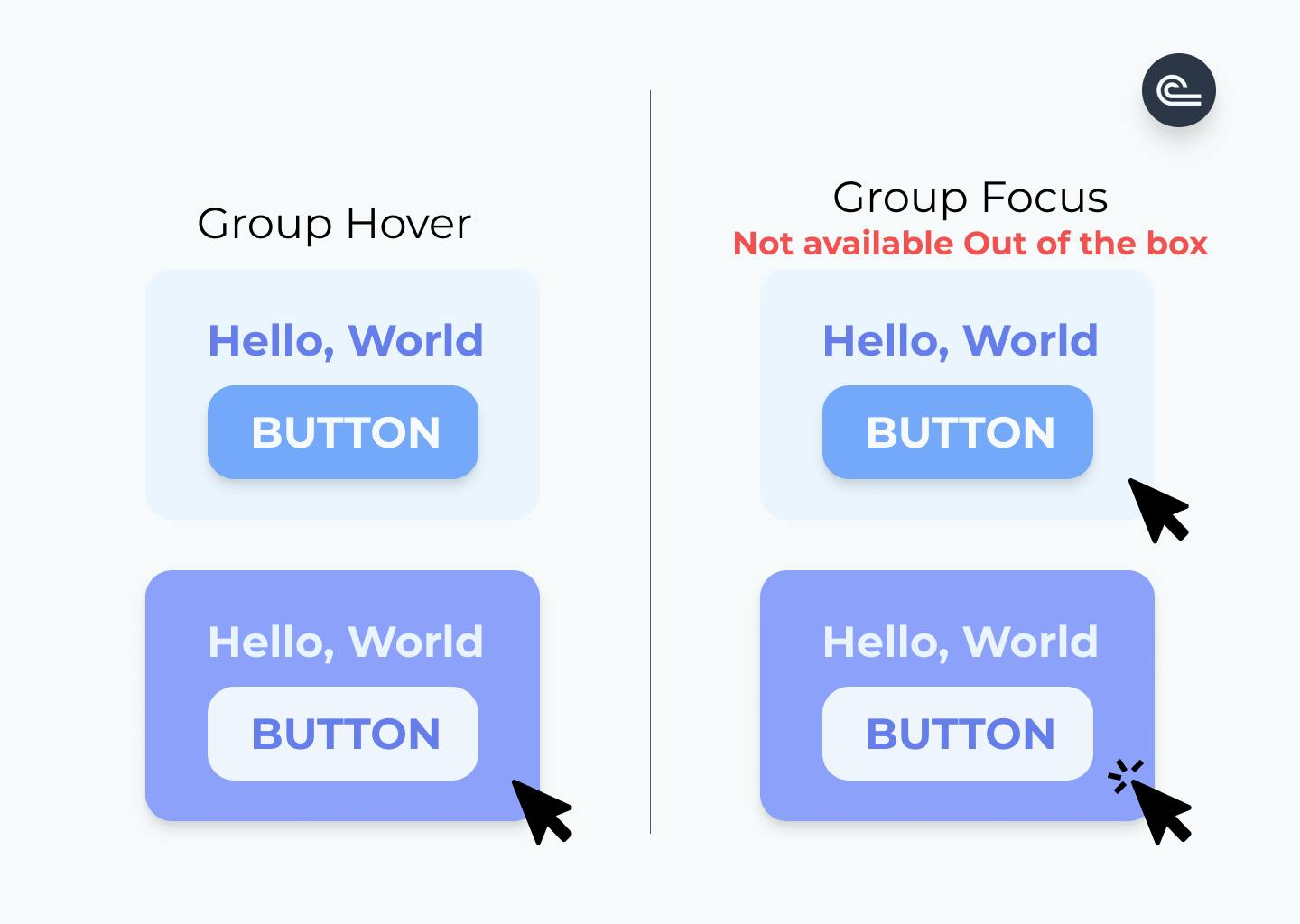
The group and group-hover utilities are used to change the child's style (group-hover) when hovering the parent element (group).
<!-- PARENT-->
<div class="group">
<!-- CHILDS-->
    <!-- Button Background will turn blue when the parent is hover -->
    <button class="group-hover:bg-blue-300">BUTTON</button>
  </div>
Group-Focus state
This utility is NOT available out of the box
The group-focus utility is used to change the child's style when focusing on the parent element.
<!-- PARENT-->
<div class="group">
<!-- CHILDS-->
    <!-- Button Background will turn blue when the parent is focused -->
    <button class="group-hover:bg-blue-300">BUTTON</button>
  </div>
State and Responsive
You can choose to create specific state conditions depending on the current breakpoint by adding a breakpoint prefix before your state prefix.
<!-- Background will turn blue on hover if the breakpoint is equal or higher than md:  -->
<!-- Background will turn red on hover if the breakpoint is equal or higher than lg: -->
<button class="md:hover:bg-blue-300 md:hover:bg-red-300">BUTTON</button>

